Driven Properties is a full-service Dubai brokerage covering buy, rent, off-plan, commercial, and luxury real estate. The site ranks well in organic search and pulls serious international traffic — but the funnel was leaking badly.
The 90-day picture (Google Analytics):
424k active users, with primary demand from China, UAE, India, US, and Singapore
10k total leads captured
97.64% of visitors left without ever contacting an agent

I built these personas by triangulating four sources: market research synthesised with NotebookLM, Gemini, and Claude; Google Analytics segment data; Microsoft Clarity session recordings; and conversations with the Driven sales team on the questions that come up in first calls.
Typically 35–55, based in Singapore, Mumbai, or Shanghai. Already owns property elsewhere and is comparing Dubai's net yields against alternatives.
Needs: No transparent financial data, transparent ROI math, community-level yield comparisons, visibility into off-plan progress.
High-net-worth, often parking capital rather than chasing returns. Browses Palm Jumeirah, Emirates Hills, Downtown.
Needs: cinematic property visuals, full floor plans, confidence the listing is real and exclusive.
Relocating to Dubai for work, first time in the UAE. Doesn't know JVC from JLT.
Needs: neighbourhood context — commute time, lifestyle fit — not just square footage.

I spent two weeks inside Microsoft Clarity — observing heatmaps, scroll maps, and session recordings across desktop and mobile. Three behavior patterns repeated everywhere:

1
The session recordings surfaced a consistent mobile pattern: the last meaningful interaction was tapping Apply Filters — not Contact Agent, not WhatsApp. Users were doing the work of searching and disappearing before the handoff to sales.
2
Across listing pages, community pages, and the homepage, the vast majority of users never reached the halfway mark. Whatever value sat below the fold might as well not have existed.
3
I observed users repeatedly clicking headings, stat numbers, and property features expecting them to do something — drill down, expand, link out. Nothing did. That behavior is a signal of unmet intent, not clumsy clicking.
Triangulated from market research (NotebookLM, Gemini), GA segments, Clarity recordings, and brokers conversations. Clarity showed where users broke. GA showed who. Market research explained why. Conversations told me what to fix.
Three major bets below — each with the decision, the reasoning, and the trade-off.
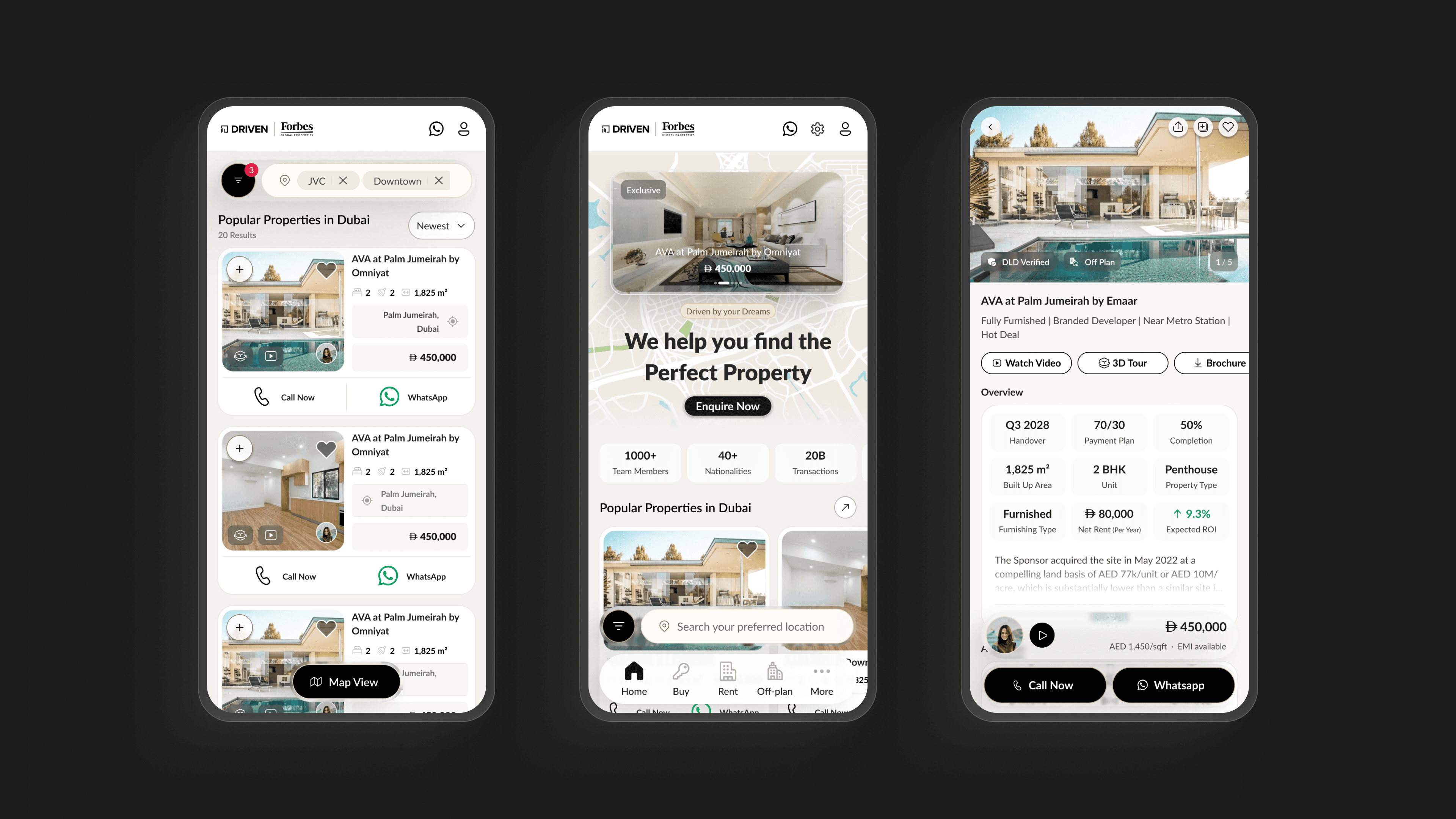
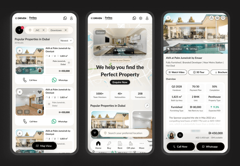
Helping users decide, then act
I rebuilt the Property Detail Page so users can take in a property the way they want. A quick audio summary if they're short on time. Clear insights if they want the details. Full specs if they're serious. And a Call and WhatsApp bar that stays at the bottom of the screen, so contacting an agent is always one tap away.
Session recordings showed users spending real time on property pages and then leaving. They weren't bored. They didn't have enough to decide, and when they did, the next step wasn't easy to find. The page had to do two things. Help them make up their mind. Then make it easy to act on it.
The trade-off
A button that stays on screen and audio controls take up space, especially on mobile. But a clean page with hidden buttons is what caused the 97.64% drop-off in the first place. So the space is worth using.
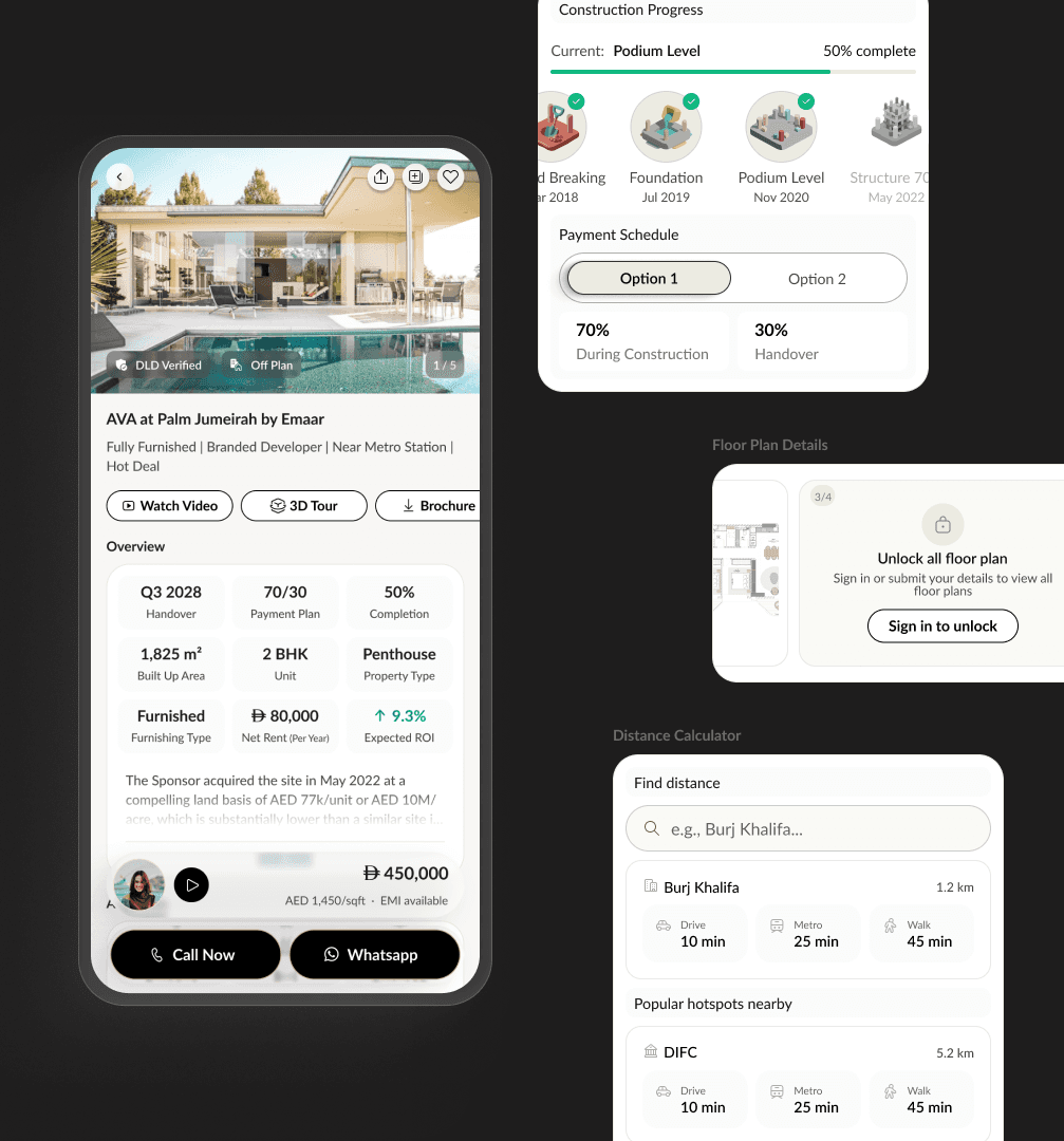
I added a Tools module on every investment property page. Six tools, all free for signed-in users. Mortgage EMI calculator. Expected ROI. Cash flow breakdown. AI-suggested similar areas. Appreciation forecasts. Rental demand stats.
Investors were emailing agents just to ask basic yield questions. Slow for them. Slow for the sales team. Putting the tools on the page means investors get instant answers to the questions they'd usually wait days for. The sign-in is a small ask in return, and it gives Driven a contact who's already done the math and is ready for a real conversation.
Adding any gate to a site that loses 97.64% of users is a risk. A free sign-in is the lightest gate possible. If people still engage, there's a clear path to a paid tier later without changing the whole flow.


I made the AI Agent equal to Manual Search, with a clear toggle at the top of the search experience. Users pick whichever way they want to search.
85% of Driven's traffic is first-time visitors who've never been to Dubai. Filter-first search expects them to know things they don't. They don't know JVC from JLT. They don't know which areas have good schools or which ones are quiet. A normal search bar punishes them for not knowing.
The AI Agent fixes that. Users can just say what they want in plain words. Something like "two-bed near good schools, under 150k AED rent." The AI turns it into filters for them.
The toggle takes up space at the top that returning users don't really need. I went with it anyway because most of the traffic is first-time visitors, and nobody loses anything. Manual search is still right there for anyone who wants it.
Instead of stopping at Figma prototypes, I built a working mobile-responsive prototype using Claude Code connected to the design system via MCP. It's live, it's real code, and it behaves the way the final product would.
Status: In progress, mobile-first. Tablet and desktop builds next. Not linked publicly, happy to share the live prototype in a conversation.
The redesign is pre-launch, so I can't claim results yet. I can say what I'd be watching for.
Visitor-to-lead conversion (2.36% today). Pre-launch, the right answer isn't a target — it's the instrumentation to learn which solution earned the lift.
I went into this expecting to find a UX problem. I found a knowledge-gap problem. The site was well-built for someone who already knew Dubai, already understood Dubai yields, already knew which agent to call. Most of the traffic was none of those people. The redesign is really just the site meeting its actual audience for the first time.